“This University Means Something Different to Each of Us” – An Interview with Noémi Koppányi, Winner of the University of Pécs Logo Competition
2025
Sep
15
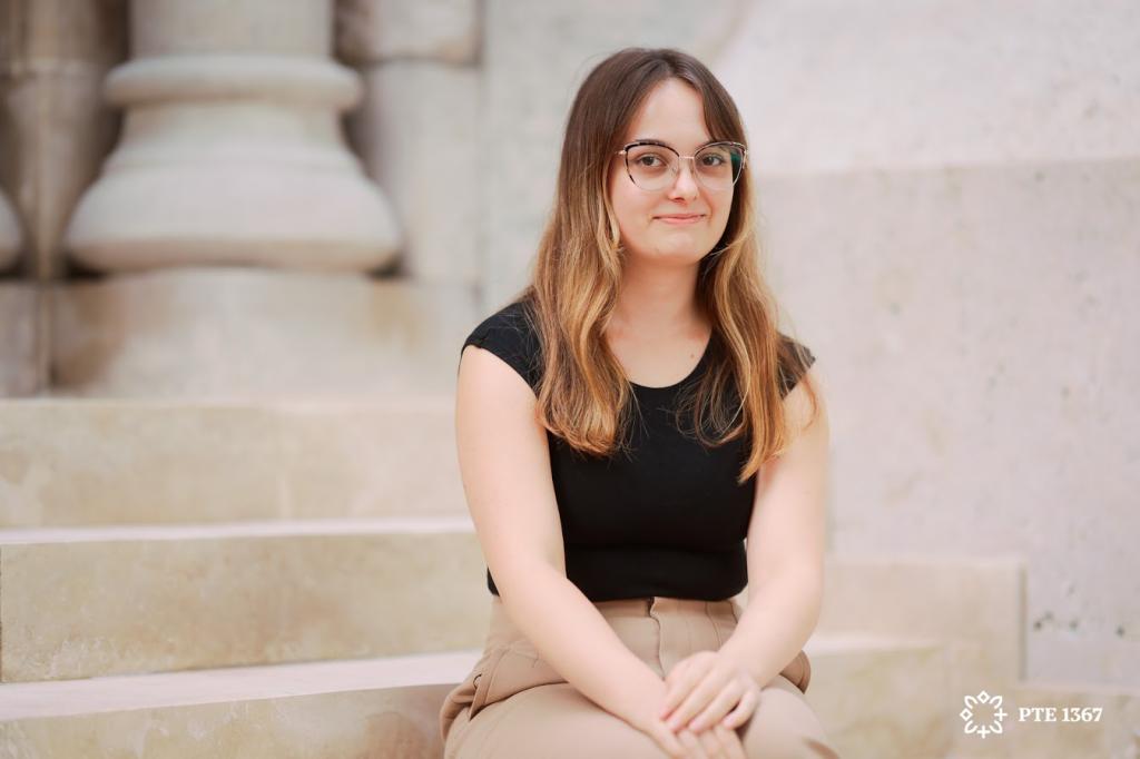
In January 2024, the Rector of the University of Pécs announced a competition open to all students of the university, regardless of faculty or field of study, with the aim of creating a new, unified visual identity for the institution. The ten-member jury, composed of representatives from the profession and the university, was chaired by Attila Auth, Ferenczy Noémi Award-winning graphic artist and Associate Professor at the Hungarian University of Fine Arts. From among the 42 submissions, the panel unanimously selected the design of Noémi Koppányi. We spoke with the graphic designer, a graduate of the Faculty of Music and Visual Arts, about the design process and her connection to the university.
When and why did you decide to become a graphic designer?
I loved creating things even in primary school, and by the age of fourteen it was already clear to me that I wanted to follow this path – which is why I chose a secondary school in this field. It was there that I developed a deeper interest in graphic design, and I realised without doubt that I wanted to continue my studies at a university where I could pursue it. At the Tóparti Grammar and Secondary School of Arts, we were often taken to the Hungarian University of Fine Arts for the semester exhibitions, and there was always at least one work that made me think: this is what I want to do.
You’re not originally from Pécs, nor did you attend secondary school here. So how did the University of Pécs come into the picture?
There were many factors that played a role in my choice. I was fortunate because I had acquaintances at most of the universities offering art programmes, so I could ask them what they thought of the training, the atmosphere, and the community. I heard a lot of positive things about PTE – not only from my secondary school teachers, but also from former students who would return from Pécs and tell us about their experiences. Those were very pleasant, informal conversations that revealed far more than any open day could.
What really appealed to me was the diversity of the teaching at PTE: since I wasn’t yet certain which direction I wanted to take within the profession, the opportunity to try out several paths was very important.
What motivated you to take part in the logo competition?
Throughout my studies I tried to make the most of these kinds of opportunities, because they are always a good test of your abilities. Even if you don’t manage to achieve a placing, you still gain professional experience that you can build on and develop further.
Looking back on your university years, what would you say the University of Pécs means to you?
I really enjoyed studying here, precisely because the teaching was so diverse and the relationship between teachers and students so informal. I never felt that a lecturer simply came in to deliver a class – rather, it was as though we were on the same level, having a conversation and exchanging suggestions. The layout of the classrooms also helped to create a workshop atmosphere, unlike in secondary school, so I could work alongside my peers and we inspired one another. To me, this sense of collaboration and community was what made the Faculty of Music and Visual Arts truly special. I also lived in halls of residence, and over the years I got to know many students from other faculties who likewise said that they loved being here because of the atmosphere.
In your thesis you examined the university’s visual identity from its foundation onwards. How did this research support your design work?
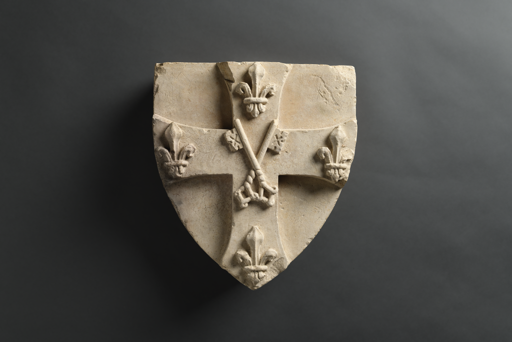
Two-thirds of my thesis was devoted to the history of the university’s visual identities; alongside a general overview of the institution’s history, I analysed its coats of arms and seals.
From the foundation in 1367 through to the identity designed by Sándor Piczehelyi, I collected and examined these visual representations. In the final section of the thesis, I took a broader marketing perspective on university branding in general.
I consider it very important – and this is reflected in the current identity as well – to clarify the relationship between the logo and the coat of arms. Professionally, the two must be separated, since each has a different purpose and place of use. The coat of arms traditionally symbolises the cultural and historical heritage of the institution, while the logo belongs to the modern identity, serving recognisability and wide applicability.
As part of my background research, I also studied the visual identities of other Hungarian and international universities. There, the coat of arms is reserved for a more dignified function: for instance, it acts as an authenticating seal on official publications, such as certifying issued diplomas. This allows traditions and historical identity to be preserved, while still leaving room for modernisation. This approach is also applied at institutions such as Stanford and MIT.
Your research must have brought to light many interesting facts. Could you give us an example?
Yes – for instance, the appearance of the faculties. When I looked into it,
I discovered that colour codes had already been assigned to the faculties during the era of the Janus Pannonius University. Later, following the university integration, both the Pollack Mihály Technical College Faculty and the Faculty of Music and Visual Arts were also given their own colours. These gradually faded away and eventually disappeared.
On old recordings of honorary doctorate ceremonies, you can clearly see the deans processing in with gowns that featured these colours, which were also defined in the visual identity guidelines of the time. Some faculties still echo their former colours – such as the brownish-burgundy of the Faculty of Humanities and Social Sciences, which can be traced back as far as the Erzsébet University.
In carrying out my research, I was greatly supported by the University History Collection of Pécs and the University Archives. As for literature, I made use of a book on university marketing by Dr Mária Törőcsik, lecturer at the Faculty of Business and Economics and former Vice-Rector for Marketing at PTE. At the same time, there were periods in the history of Janus Pannonius University for which I could find no material, so I reached out to Dr Gabriella Kuráth, who worked in the university’s Marketing Department both before and after integration. She was very helpful, particularly in terms of identifying sources.
In my final year at the Faculty of Arts, my work revolved entirely around the visual identity of PTE, partly because of the logo competition and partly because of my thesis. The fact that I was able to incorporate my contribution into my diploma project meant that I could dedicate myself wholeheartedly to this undertaking.
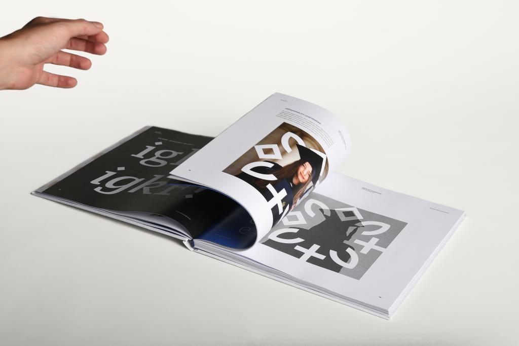
Sándor Pinczehelyi, Munkácsy Prize-winning artist and creator of the previous identity, was also a member of the jury. He, among others, highlighted one of the most exciting aspects of the new logo: the space at its centre. What was your intention with this element?
At first, my approach was simply to abstract the coat of arms, but I felt that this alone could not fully capture everything the university represents. Traditions and their visual expression are important, of course, but so too is what PTE means today. In the logo, this open space allows everyone to “fill it in” for themselves – to express and show what the university means to them.
For some, it is where lifelong friendships are formed; for others, it is where they achieve their greatest successes or reach the pinnacle of their academic work. The university means something different to each of us, and it is incredibly diverse.
I wanted to make room for this diversity, which comes through most strongly in the use of imagery – for example, as reflected in posters.
How did you feel when it was announced that the professional jury had unanimously chosen your work?
It was a wonderful feeling, as I had never experienced success on this scale before. At first it seemed unbelievable – I couldn’t even take it in when Gergő Böhm phoned me to say that my design had been selected. Now, though, I constantly see the outcome of what we worked so hard on. After the orientation days, it was especially moving to walk through the city and see first-year students carrying the tote bags and water bottles they had been given, proudly using items featuring the new design.
The new PTE logo also aligns with the recently renewed emblem of the city of Pécs, which was also created by a student of the Faculty of Music and Visual Arts, Eszter Hudák. How intentional was this connection?
As part of the competition, Gergő Böhm advised us that it would be worthwhile to bring the two identities closer together, since the university and the city are so closely intertwined. The atmosphere and liveability of Pécs shape the university as a whole, just as the university has a major influence on the city itself. Pécs is truly a university town – something that is now reflected in the new identity as well.
Looking back, perhaps preparing the competition entry was the simplest part of the rebranding process. What challenges have you faced since then?
Developing the full identity proved to be a far more complex and demanding task. Under the professional guidance of Gergő Böhm, I worked together with Eszter Kovács and András Csányi on the visual identity handbook for almost a year. From the University’s Directorate of Communications, Zoltán Győrffy and Attila Hirth also supported us throughout the process. Another major undertaking was the design of the PTE typeface, which was created by Oszkár Boskovitz.
Since the university is made up of so many faculties and institutes, we had to find appropriate visual solutions for each of them. Over the past year we therefore held ongoing consultations with the faculties about their colours and their representation within the new unified identity. What greatly eased our task was that we did not meet with resistance – instead, we were able to work together, with the faculties supporting and assisting us in the process.
- Log in to post comments
News


Faculties
University of Pécs
International Centre | Rector's Cabinet
H-7622 Pécs, Vasvári Pál str. 4.
+36-72/501-500/61682


University of Pécs | Chancellery | IT Directorate | Portal group - 2020.